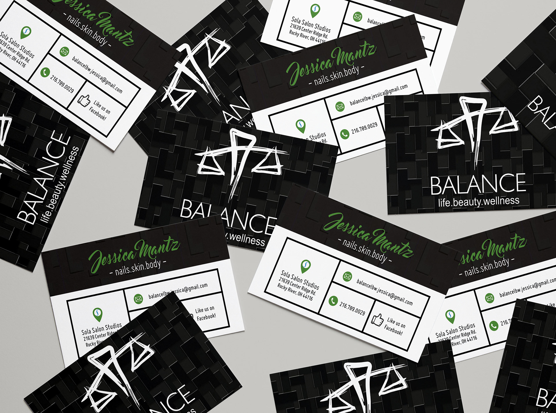
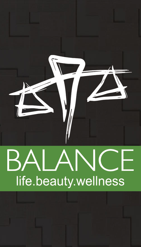
BALANCE
| Business Card Design |
| Business Card Design |
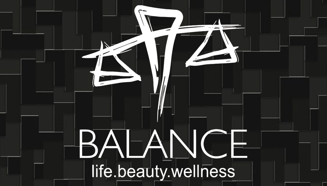
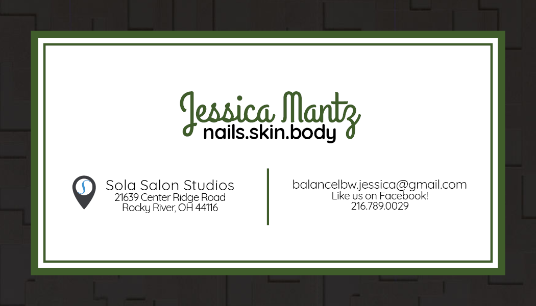
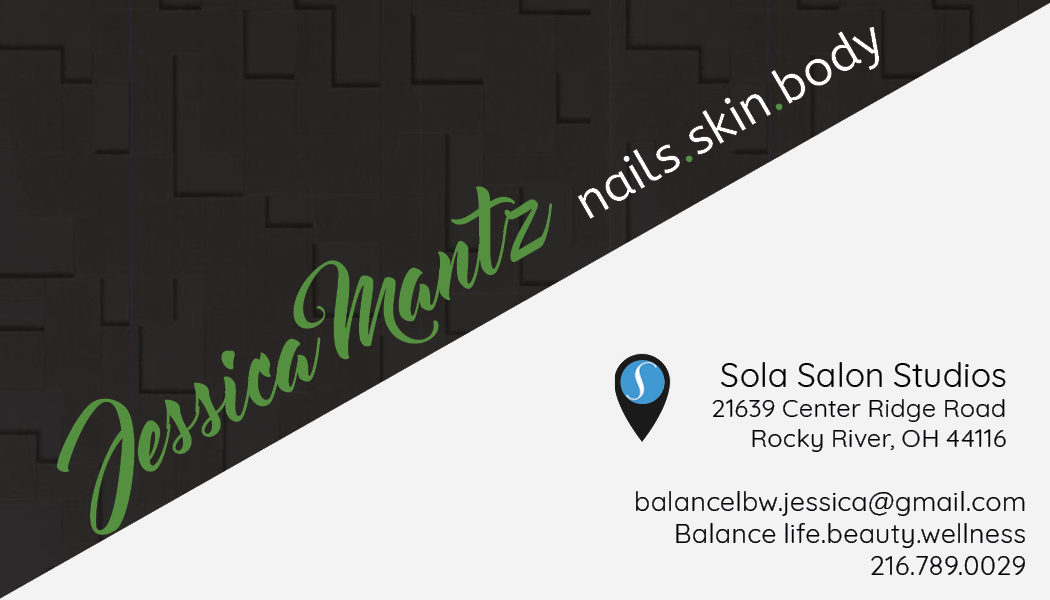
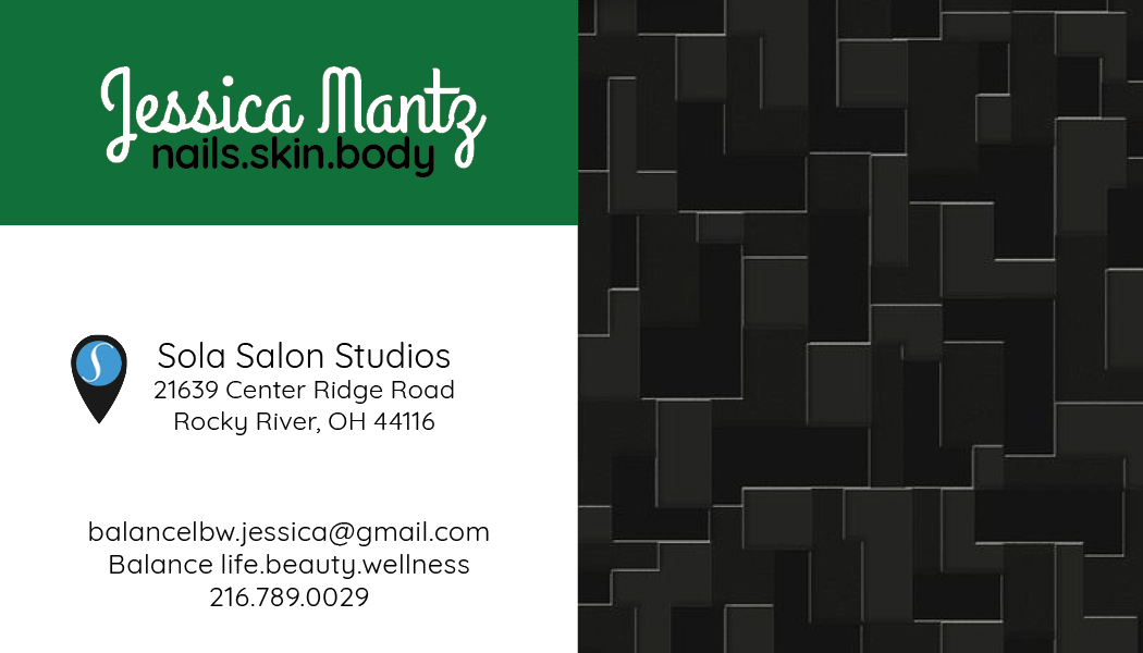
BALANCE is a salon that is placed in a Sola Salon Studios location along with a variety of other businesses, they were looking to upgrade their business cards. The design was very basic and lacked hierarchy when it came to the contact information. They were also looking to update their color scheme for their branding so the business cards were a good place to start to help them stand apart from their competitors. After learning more about their brand and where the relationship they have with their location we wanted to make sure that there was a clear distinction between the two on their cards so people can find them easily.
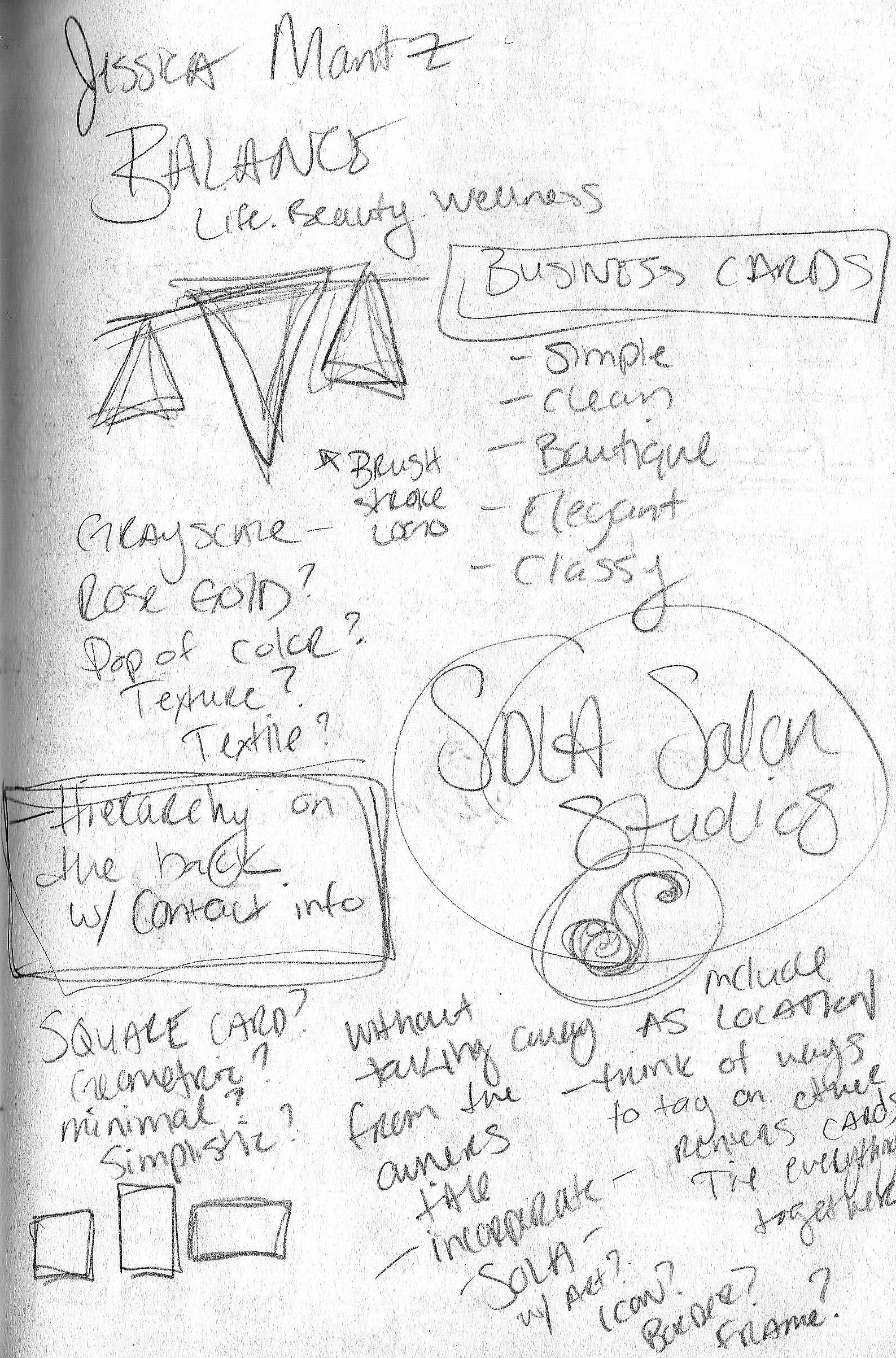
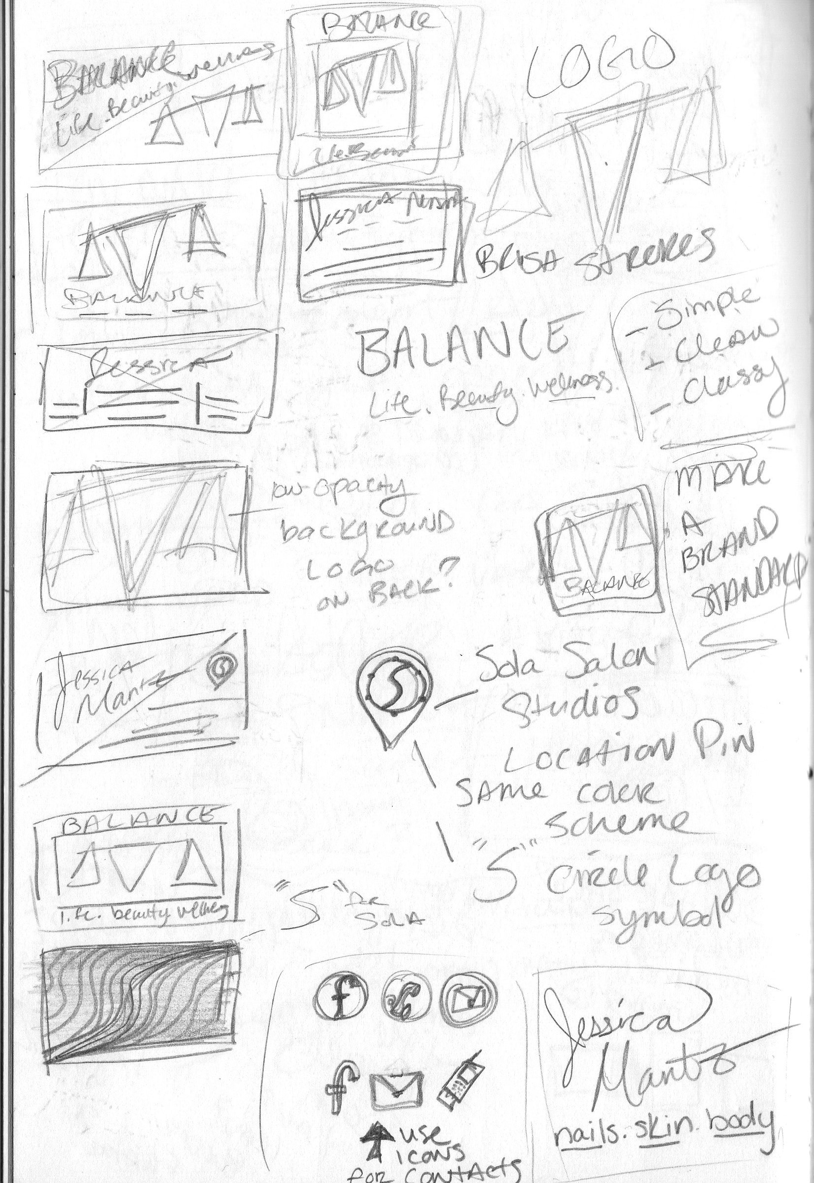
____________________after sketching my ideas I start to put them together in digital form____________________
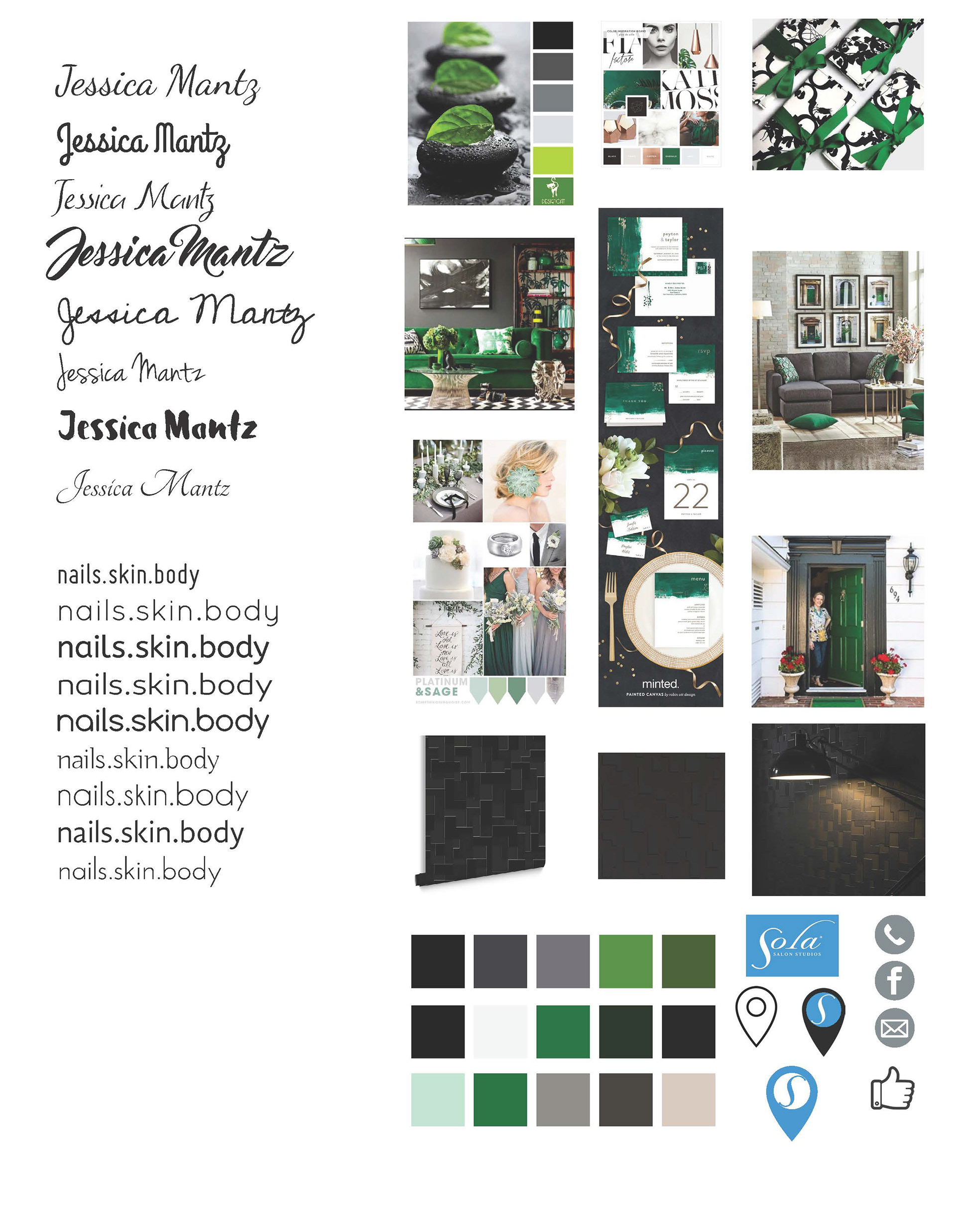
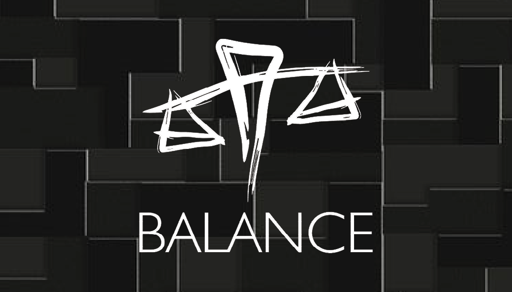
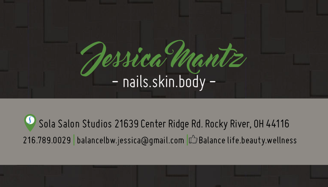
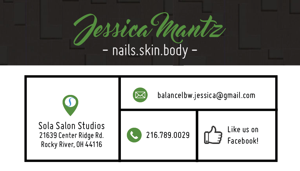
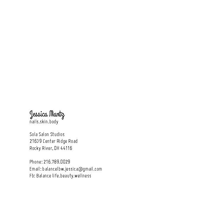
__________first focused on the hierarchy of the contact info and tried out a square size card__________

____Wanted to add a textural element to their business cards that wouldn't be too distracting and fit well with their color scheme. BALANCE were planning to redecorate their interior walls with this new sleek wallpaper that I chose to incorporate into the design of the cards because it was clean but still gave a pop of dimension____
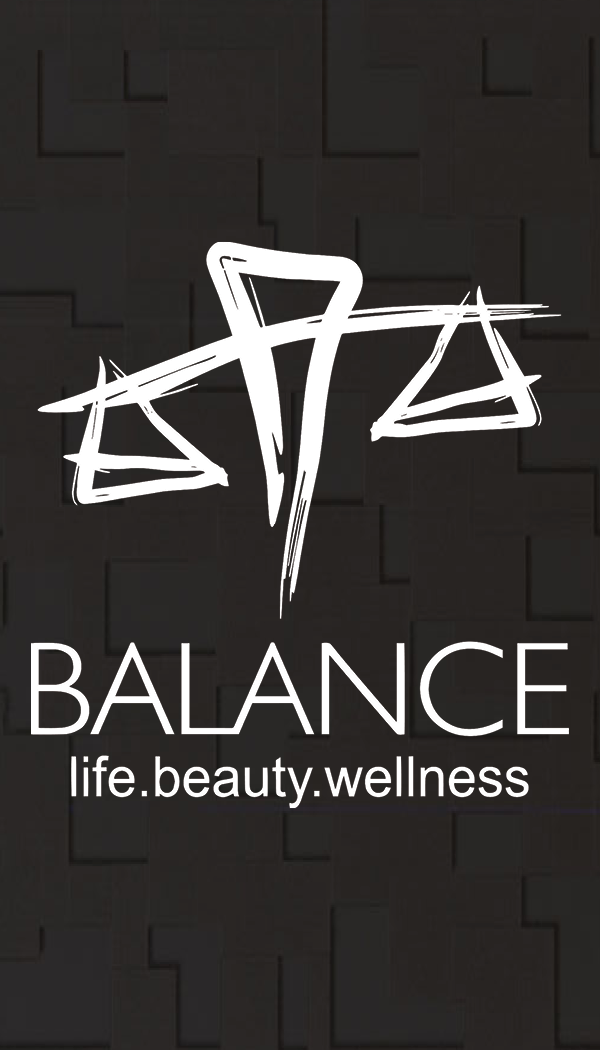

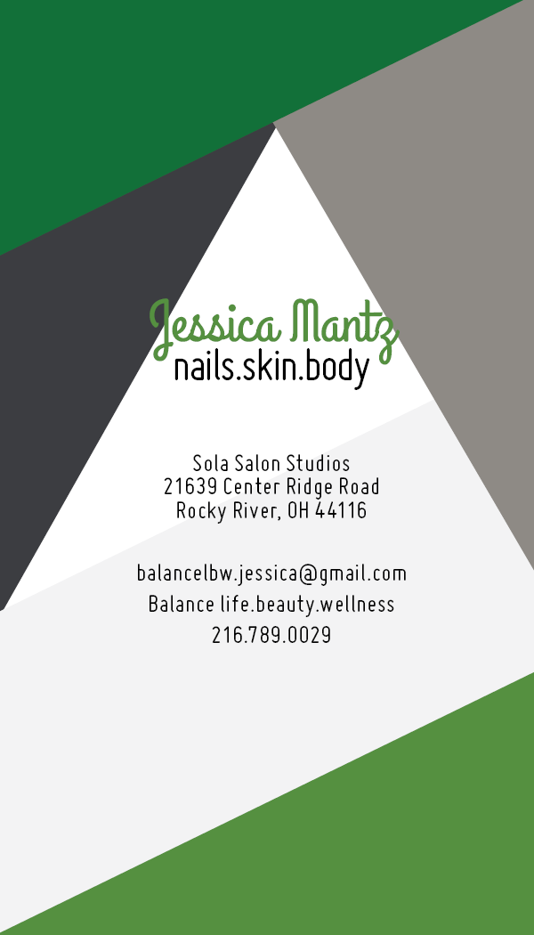
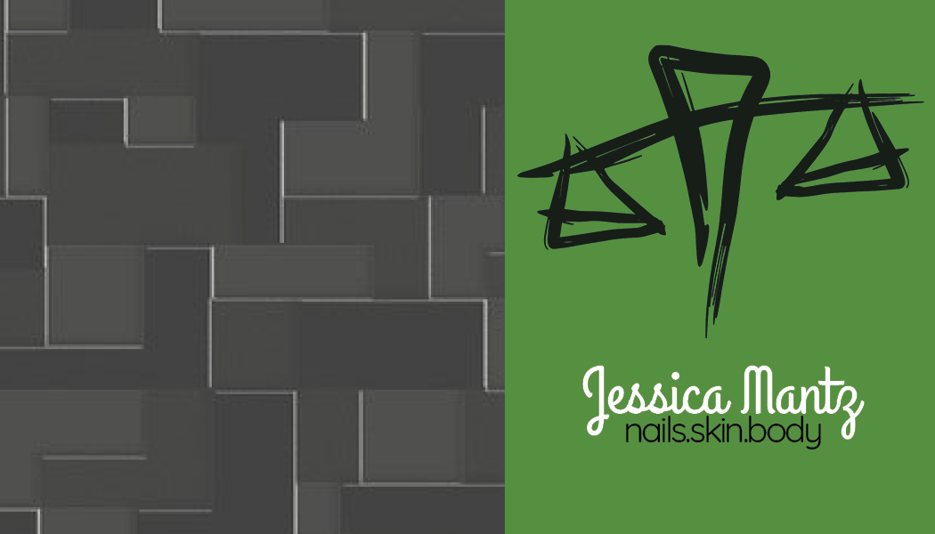
____________________switched to a horizontal layout and continued to play with elements and color____________________